A new logo for Cliniko
Back in December 2012 when I was applying for the job as designer at Red Guava, I asked Joel if he would be open to allowing me to redesign the Cliniko logo. He replied, “I never rule out anything but we have done a lot of branding work already and have got some great recognition for our logo. There would need to be business sense in doing so.” I took that as a yes and didn't look back.
I dived right in to redesigning the Cliniko marketing website, but for reasons I can't really fathom in hindsight, we decided to keep the existing logo and redesign around it. When I finished the redesign, I was swept up in other projects, so the logo stayed as it was.
Sometime around June 2013 when I was in Berlin, I found myself between projects and decided to take a look at the Cliniko logo. I spent a few frustrating days getting nowhere before I decided to shelve it and pick it up at a later date.
Unfinished business
In the last few of months of 2013, we finished up a few big projects that had been keeping us occupied; a redesigned online bookings for Cliniko, we created Jobiko from the ground up in a couple of weeks, and I redesigned our Red Guava website.
The next major project on my plate is to start work on the Cliniko application itself. With that looming, I figured there's no better time to pick up where I left off back in Berlin. The recently completed Red Guava redesign had included a new logo which was a success and fun to work on, so I was feeling fired up and positive about the Cliniko logo.
Starting from scratch
Having been frustrated in my first attempt, I wanted to really have a go at a logical and thorough approach this time around. We had just put up a massive white board at Red Guava HQ1, so I started listing out a few key words and themes that relate to Cliniko. Under each of these I listed as many associated words as I could think of. I also, rather pretentiously, listed a bunch of personality traits that Cliniko might have if it were a person, in the naive hope that by just doing more stuff I would end up in a better position than I was at the time.
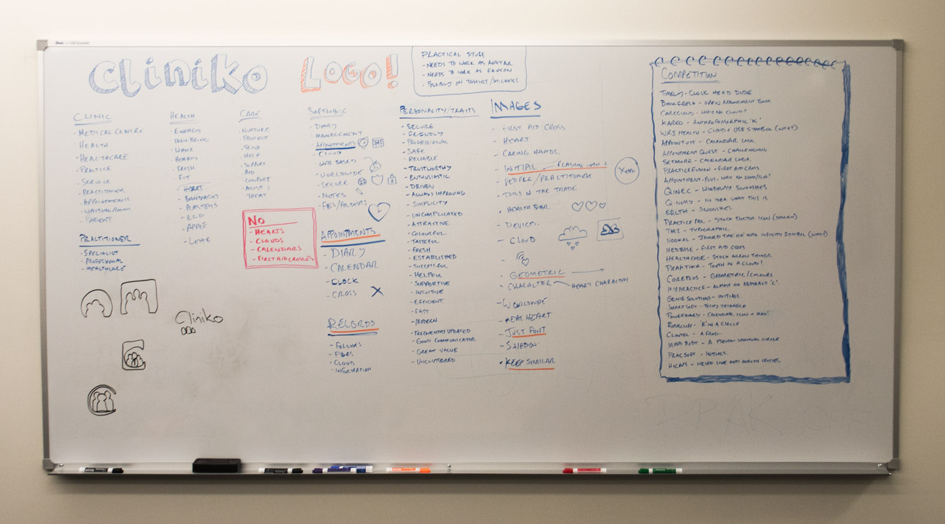
Referring to these lists, I then started brainstorming potential visual elements that might work as in a logo. I threw myself into Photoshop and Illustrator and started drawing indiscriminately, adding to the work I had done back in June2. But nothing jumped out. Joel didn't want to use a cross or a heart. Tools of the trade and practitioner related imagery is difficult; if we used a stethoscope or something similar, then we would be alienating most of our customers since the clinics are so varied. Calendars and clocks and clouds would all work well enough, but immediately strike me as being overused on the web.
Following this, I spent an afternoon trawling through our competitors websites to see what the rest of the industry was doing. There's no polite way of saying this, but almost without exception, our competitors have horrible, horrible logos. There are the usual swooshes, the stock icons (probably stolen off a Google image search), and the unrelated geometric shapes. Then there is all the stuff I had listed above: clouds, calendars, hearts, crosses, etc. The benefit of all this research was that it taught us once and for all that we don't want to fall on a cliche like a heart in a cloud. There are already too many heart/cloud logos out there for one internet.
Designer's block
One evening a couple of years ago, I attended an informal lecture given by Bob Gill at the Pentagram studio in London. Something he said regarding finding inspiration for a logo has stuck with me ever since: if you can't come up with a great idea for a logo, it's your fault. You can't blame it on a boring or inspirationless client (to paraphrase). And yet, by this point, here I was again, back at the beginning again without a shred of inspiration to follow.
Feeling myself flailing around in the dark, I took a break and went into Melbourne and found myself in a bookshop looking at design books. I bought a copy of Logo Creed by Bill Gardner and devoured most of it that evening and the next morning. I felt re-ignited again and took from it one resounding piece of advice regarding logo redesigns:
Less experienced designers (and sometimes the client themself) often want to simply abandon the old logo and start with a completely clean slate, but this is malpractice, pure and simple. The client's existing identity likely has both positive and negative equity. Both are tools you can use in your new design: What was wrong and why? What was right? You may determine that there is 90 percent negative equity and 10 percent positive equity—but despite the unbalance, this means there is still some part of the old identity that has value and should be considered for preservation. Is it the color? A pattern or shape? The line weights? A font?
Rebrand or redesign?
It's sometimes too easy to lose sight of existing custom when focussing on the future. Though Cliniko might be a relatively small product compared to our hopes and expectations for it, we have thousands of users who have already formed a relationship with the software and the brand. Thousands of users who keep us in a job. The more I thought about it, the more it seemed wrong to rip it all apart and confuse and shock our customers with a new identity.
So, I went back to the original logo to see what we have3. Joel had the original logo designed through Crowd Spring, a website for crowdsourced creative services like logo design and web design, in Cliniko's early days. If I was to take Bill Gardner's advice and look for what works in the logo, I might say:
- The Cliniko brand colours work very well.
- The wordmark and logo fit well in the head of the website.
- The three characters logo works well for social media avatars, favicons, etc.
- The three characters logo has a good level of brand recognition for our existing customers and others in the industry.
I was surprised to discover that most of my criticism was technical:
- The Cliniko wordmark can be somewhat illegible.
- The font (or lettering?) is simply horrible.
- The 'n' with it's disconnected shoulder and ugly curve is confusing.
- The wordmark is too condensed.
- If you look at it long enough, the o becomes separated, becoming 'Clinik o'.
- The three characters logo is poorly executed, with some technical errors when zoomed.
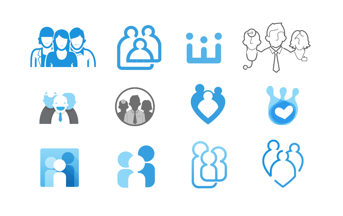
Excited to have a direction, I jumped in and started jamming around with different versions of the three characters logo4. I did a lot of these and felt like I might be getting somewhere, until I started trying to drop them in situ on the website. The best logos just didn’t fit, or wouldn’t fit without a redesign of the website. The ones that would fit just weren’t inspiring or enough of a change to justify their use.
Back where we started
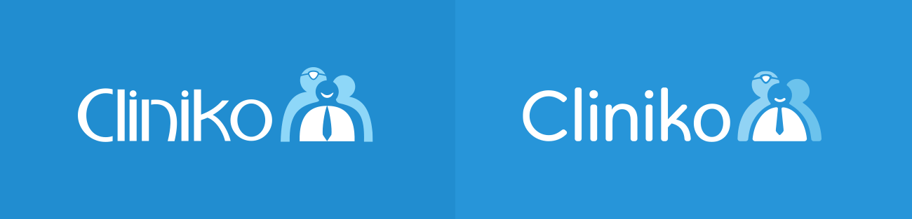
And so on the friday morning, the last day I had before setting off on a two week road trip around south east Australia, I scrapped everything and opened up the original logo file in Illustrator. I redrew the three characters logo. I shortened the tie. I friendlied-up the creepy smile. I softened the hunched shoulders. I improved the symmetry. I dropped the tone of one of the background characters a touch.
Then I turned to the wordmark, which would be a bigger change. I used Myriad as a base. I really disliked the capital 'C' from Myriad, so I grabbed one from Boneveno and fattened it up some. I rounded all the edges manually and curved the leg of the 'k' as a nod to the predecessor, and to add some character and recognisability when disconnected from the three characters logo5.
Summary
To be totally honest, I can’t help but feel like something of a failure. I started out hoping to put my stamp on our product, as any product designer would, but ended up making small improvements to a not-so-great logo that was crowdsourced. Though, of course, I do see the value in honouring the existing brand (and putting that before designer ego). I just wish I had seen it from the beginning rather than spending a week rolling around in fear of failure and self-doubt.
A positive that I take from the result is that it suits the overall iterative redesign approach that I intend to tackle the Cliniko app with. That being, I will make small changes like a colour here and a font there, improve the typography throughout, tidy up the forms, make the buttons consistent, etc. Small changes that aren’t always noticable, but which add up over time to a better design, before I start getting my teeth into future changes that customers might find more challenging, such as a reorganisation and repositioning of the navigation. An iterative change to the logo feels right in this respect.
What’s more, an iterative approach means that I can come back to it again at some point… I can’t tell if that makes me happy or if it scares the hell out of me.